DERMWORX

Dermworx knows that skin is beyond daytime needs. Considering that their current lineup has a distinct look and feel that reads similarly, Dermworx wanted something different for their entry to a nighttime serum they would launch. I aimed to create a look and feel for a nighttime serum that stood out from the rest of the lineup.
Mood Board
-
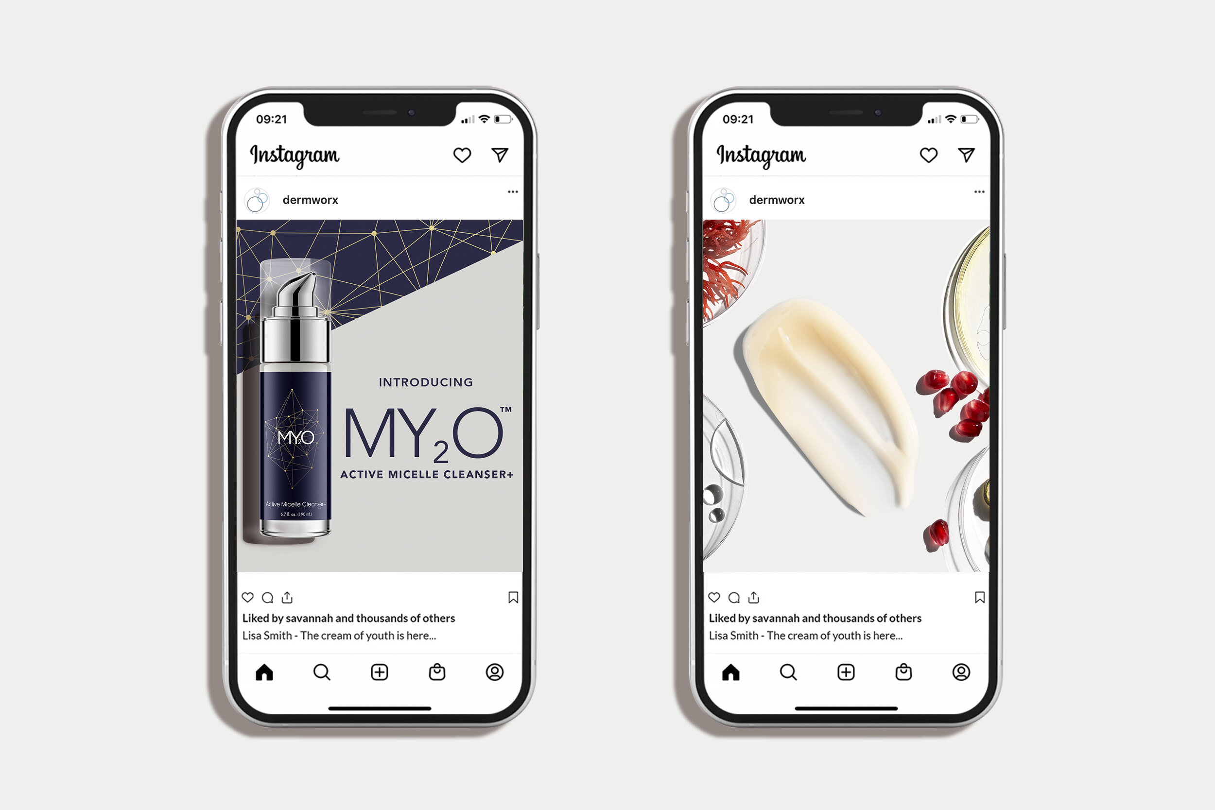
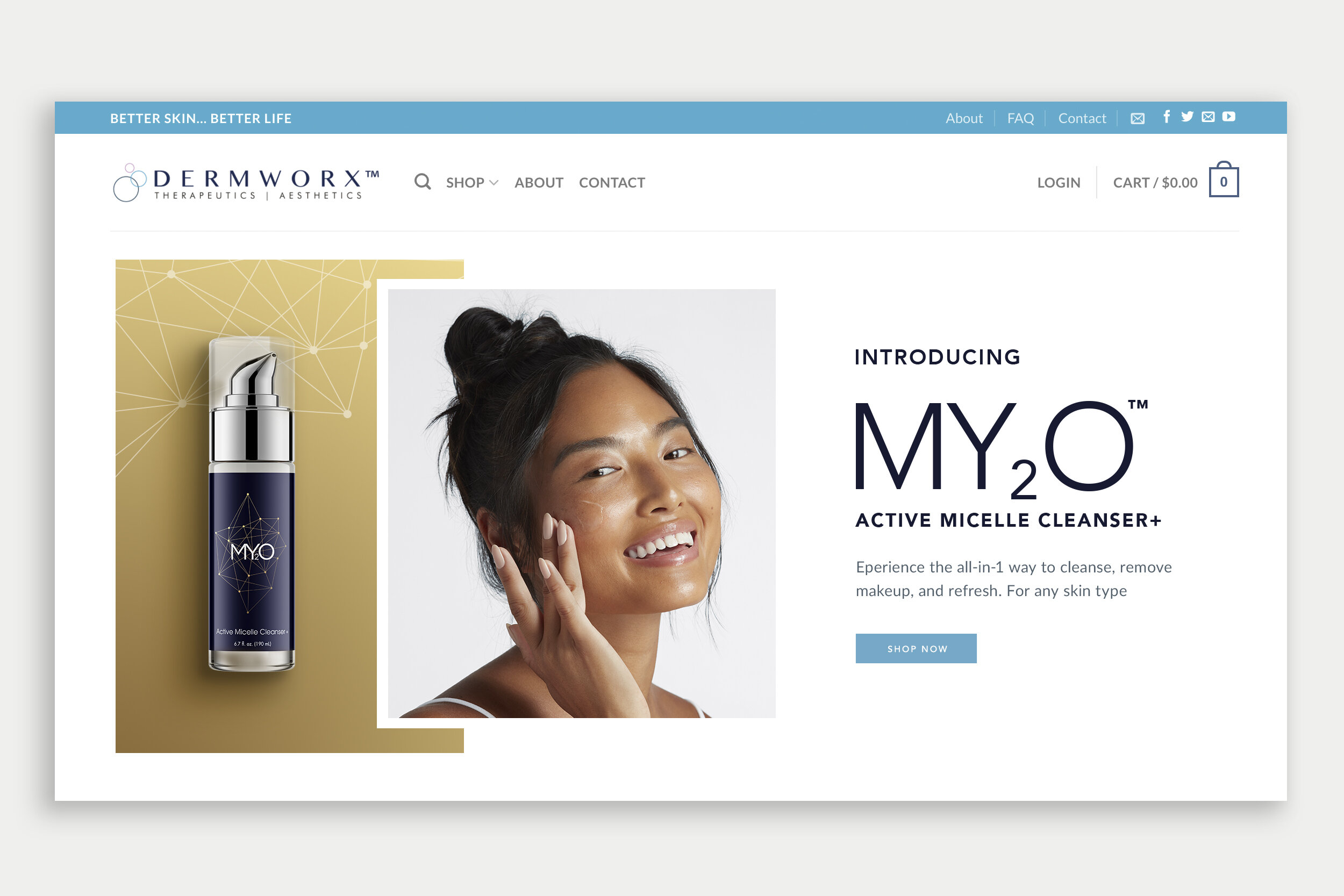
Since the brand leans into its science-backed formulas, we focused on showing petri dishes and ingredients. The models would be shot in a straightforward view with a clean background to maintain focus on the fresh, clean skin.
-
The colors needed to lean into the nighttime. We landed on the darker blue and gold for the packaging and the clean white with the ingredients showing off for the rest.
-
Logo
The new line needed a lockup that could live with the rest of their products.
Packaging
Primary label and secondary packaging
Strategy
Research
Identity
Logo Design
Packaging Design
Visual Design System


The Campaign
Dermworx focuses on the science behind its products and their active ingredients. My efforts were to combine nighttime with science, so the campaign kept the science elements with the Petri dishes and ingredients. In the research, we saw that compounds looked a lot like constellations, which is why we used a faux chemical compound as a constellation and enhanced with the color pallet on the box and component.